As for the design, it changes and has some new features
Android 12 will look entirely different from previous Android versions; it’s more modern and personal than ever. There’s a reason for that: Google developed a new theming engine for Android that extracts colors from your device’s wallpaper and applies them to various parts of the OS, such as your lock screen, quick settings panel, settings menu, widgets, and more.
The system identifies both primary and complementary colors of the wallpaper to apply to the software. And if you aren’t a fan of a particular color scheme, you can customize it.
In the first Android 12 beta, you get the same customization options you’d normally find on Android 11. You can choose from a number of pre-determined accent colors in the Styles & Wallpapers settings menu. Nothing is applied from your current wallpaper, though. Android 12 will also introduce all-new widgets and a new home screen layout, but again, those aren’t available yet.
Refined quick settings and notification shade

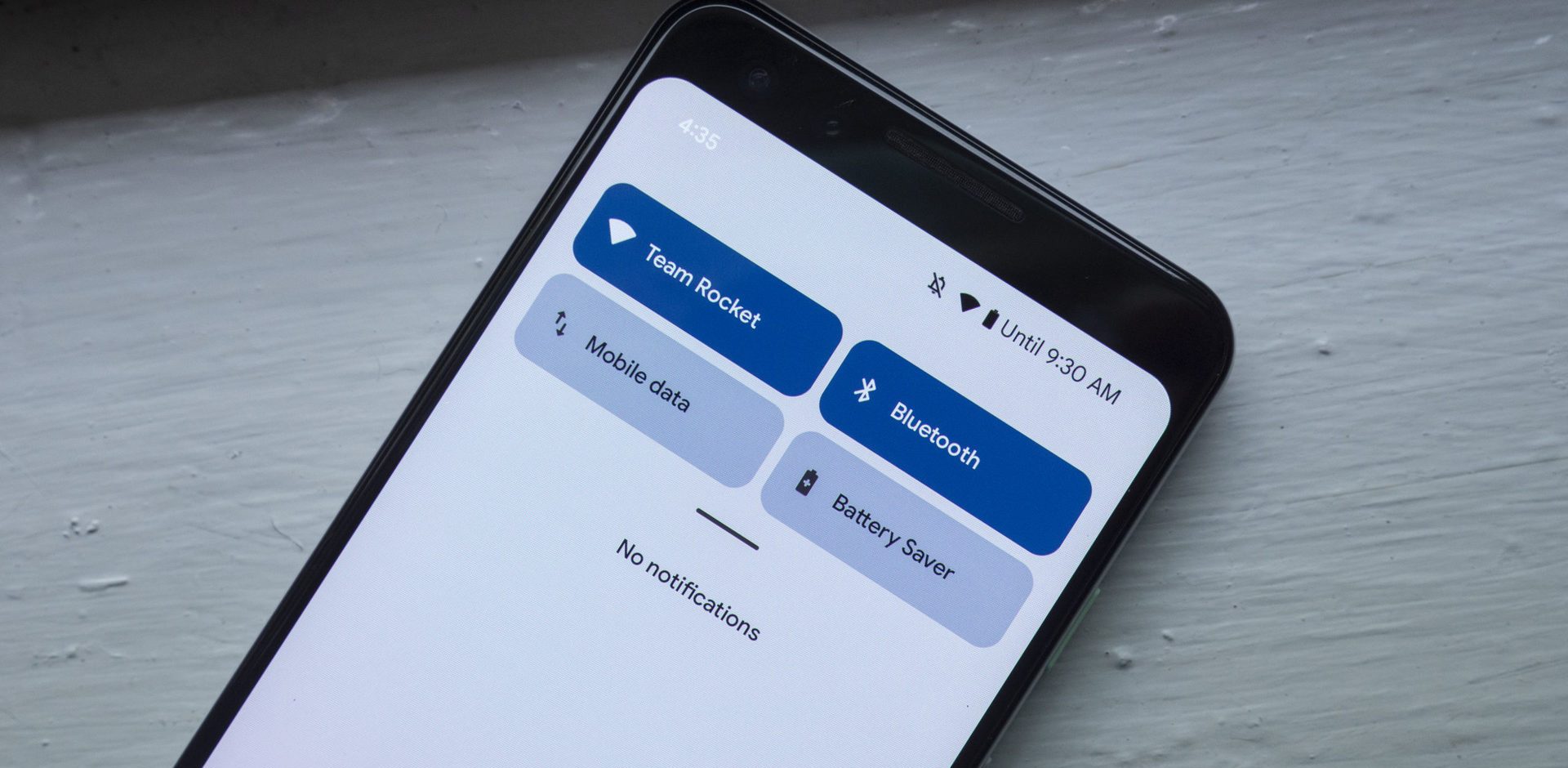
The fast settings panel has always been one of the most functional tools on Android. This is where you access your brightness slider, various device settings, and even your media control notifications following the launch of Android 11.
Currently, it’s time for another major change.
The fast settings panel still exists, but it looks entirely different. Gone are the small circular icons and thin brightness slider. Each of icons is a long, rectangular button containing the individual settings icon, description, and situation.
New type lock screen and always-on display
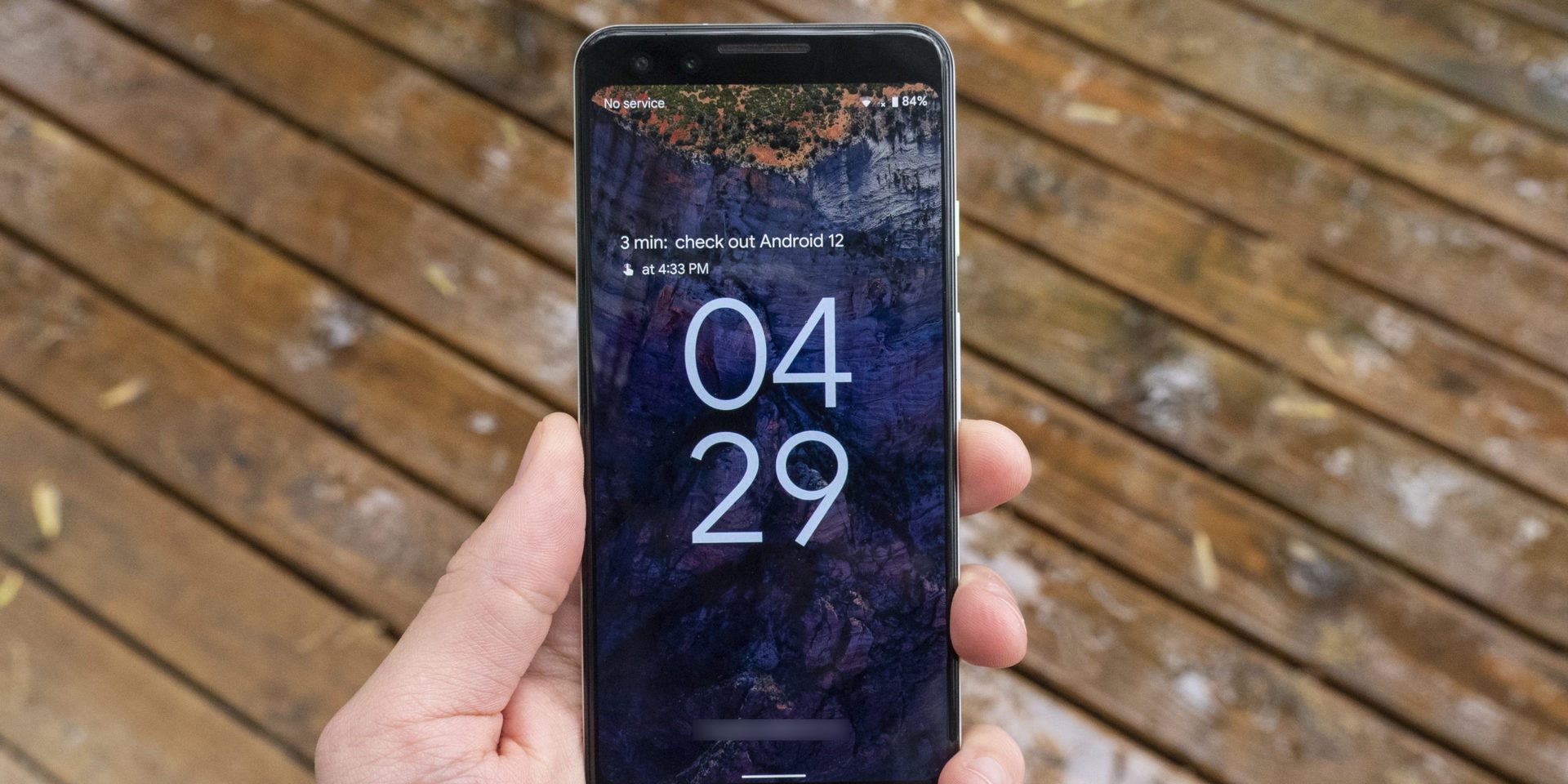
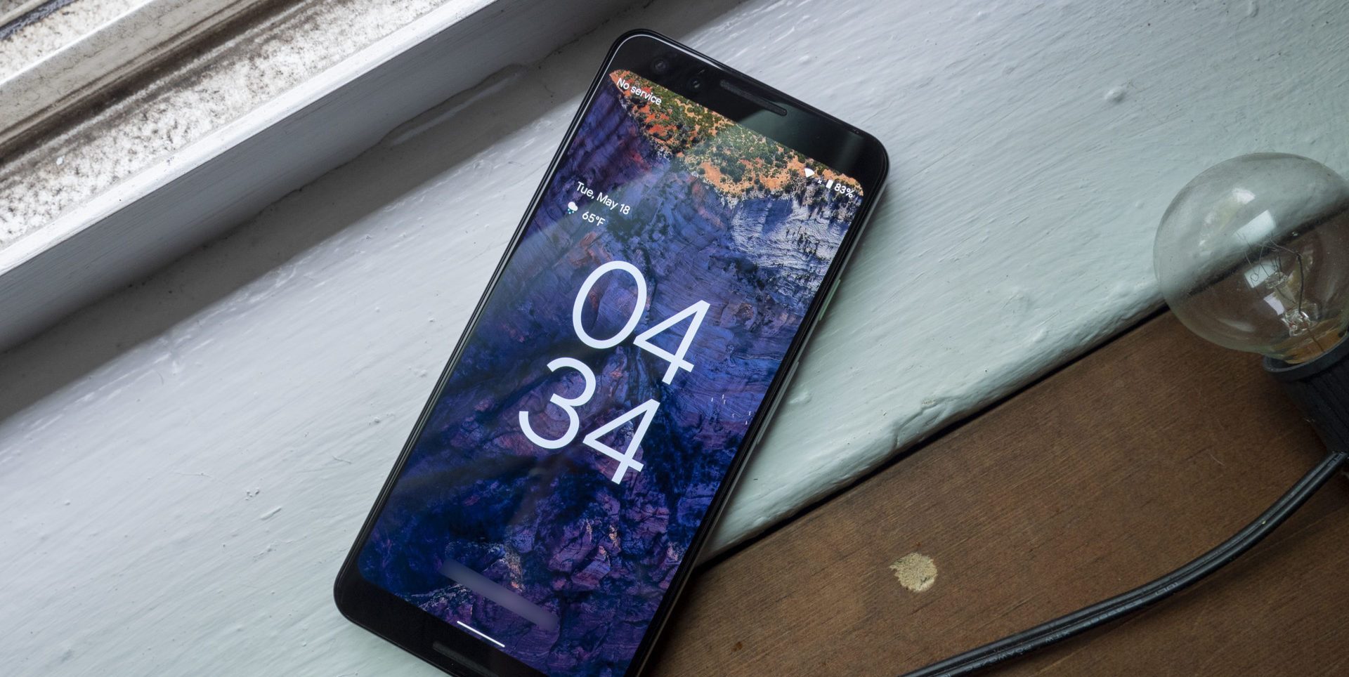
Android’s lock screen and always-on displays have also gone unchanged over the years, but that’s changing with Android 12.
In the past versions, you’d only see a static digital clock with the date and weather underneath. Notifications would show up below that, while the battery percentage was found at the very bottom of the screen.
The Android 12 introduces a new clock that takes up a big part of the display when you have no notifications. It’s easy to see from a distance, and the bigger clock should signal you that there are no new notifications to check. When a notification comes in, it appears in its normal spot, however the clock, date, and weather info minimizes and moves to the top-left of the screen.