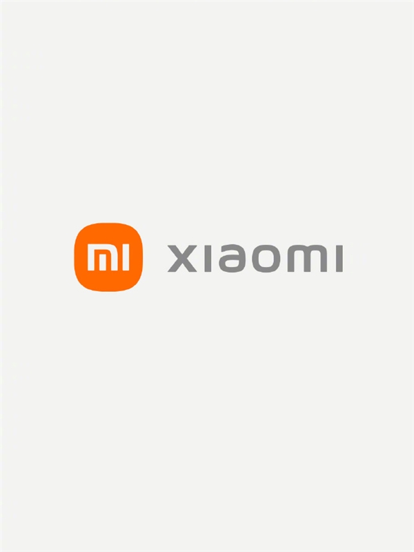
As soon as the conference started, Lei Jun announced the new Xiaomi Logo. It is reported that the new Logo is designed by the famous international designer Hara Kenya, who proposes a new design concept and integrates oriental philosophy into the vision of the Xiaomi brand.
On the surface, the new logo only changes from a square to a round, but behind it incorporates the designer’s thinking on the “Alive” design concept. Xiaomi’s new LOGO with the beauty of “super-ellipse” mathematics is no longer limited to a corner of the screen as if it has life.
Hara Kenya said that Xiaomi’s brand vision should incorporate Eastern philosophical thinking. The more technology evolves, the closer it is to the form of life.
While designing the new logo, Kenya Hara also redesigned the Xiaomi letter logo. He said that when using it, it is best to use the logo and the letter Logo separately.
For brand image, Kenya Hara recommends using only brand logos. For devices such as higher-precision smartphones, the effect of using alphabetic logos is higher.
Besides, Xiaomi’s original brand color, orange, is retained and will continue to be used as the corporate brand color. At the same time, black and silver are added as auxiliary colors, which are used in high-tech products.